This is a blog series that documents my journey of building a Hugo theme https://github.com/tomowang/hugo-theme-tailwind from scratch. The entire series consists of four articles, and this is the third:
- I. Introduction to the background of building the Hugo theme, my ideas for the theme’s features, and the development environment setup
- II. The main directory structure of the Hugo theme, the technologies involved, and the main framework of the theme I created
- III. Additional features of the Hugo theme, including dark mode, responsive design, multilingual support, code highlighting, and build pipeline
- IV. This part describes non-code-related content, including continuous integration (CI), how to submit to the official theme site, and SEO-related data
Dark Mode
tailwindcss makes handling dark mode very convenient. Based on the original light theme, we only need to set the display style under the dark theme through the dark: prefix.
Add the darkMode: 'class' configuration in tailwind.config.js, and then we can modify the styles in the theme.
For details on dark mode, please refer to the official documentation: https://tailwindcss.com/docs/dark-mode
It’s worth mentioning the dark mode toggle button. To keep the theme as simple as possible and avoid referencing additional front-end frameworks,
I researched some common theme button toggle examples in tailwindcss and found that using input + peer + group could achieve the desired effect very well.
The code is as follows:
<div class="darkmode-toggle flex flex-none ml-2">
  <label class="flex items-center px-3 cursor-pointer rounded-full bg-gray-100 dark:bg-gray-600">
    <input type="checkbox" class="sr-only peer">
    <div class="group flex flex-row gap-1 justify-center h-8 px-1 rounded-full bg-white dark:bg-gray-700">
      <i class="h-6 w-6 flex-none rounded-full bg-yellow-400 place-self-center peer-checked:group-[]:invisible">
        {{ partial "icon" "brightness-down" }}
      </i>
      <i class="h-6 w-6 flex-none rounded-full place-self-center invisible peer-checked:group-[]:visible">
        {{ partial "icon" "moon-stars" }}
      </i>
    </div>
  </label>
</div>
I use <input type="checkbox"> to control the theme variable, and then define a group of icons using <div class="group">. Each icon uses peer-checked:group-[]:invisible and peer-checked:group-[]:visible to control visibility and hiding.
This way, I only need to pay attention to the value of the checkbox, while the icon switching of the button is completely handled by tailwindcss.
const themeToggle = document.querySelector('.darkmode-toggle input');

themeToggle.addEventListener('change', function () {
  if (this.checked) {
    localStorage.theme = dark;
    document.documentElement.classList.add(dark);
  } else {
    localStorage.theme = light;
    document.documentElement.classList.remove(dark);
  }
});
Regarding group and peer, tailwindcss describes them as:
The dark theme implementation took me a day of spare time, and the final code is at #75c6b41 .
Responsive Design
tailwindcss also makes responsive design easy to use. My goal is to support both mobile and PC. When designing with mobile-first in mind,tailwindcss uses prefix-less components to design mobile styles first, and then uses prefixed components (e.g., md:) to override styles at other screen sizes. My modifications are as follows:
index ad2e93f..e5b7d76 100644
--- a/layouts/_default/list.html
+++ b/layouts/_default/list.html
@@ -15,9 +15,9 @@

   <div class="flex flex-col w-full max-w-4xl lg:max-w-5xl relative">
     <div class="flex flex-row">
-      <section class="flex flex-col w-2/3">
+      <section class="flex flex-col w-full md:w-2/3">
         {{ range (.Paginate $pages).Pages }}
-          <article class="flex flex-col gap-y-3 p-6 mt-6 rounded-lg shadow-md bg-white dark:bg-gray-700">
+          <article class="flex flex-col gap-y-3 p-6 mt-6 mx-2 md:mx-0 rounded-lg shadow-md bg-white dark:bg-gray-700">
             <h2 class="text-4xl font-semibold text-slate-800 dark:text-slate-200">
               <a href="{{ .RelPermalink }}">{{ .Title | markdownify }}</a>
             </h2>
@@ -40,7 +40,7 @@
           </article>
         {{ end }}
       </section>
-      <aside class="flex flex-col w-1/3 mx-3 top-0 sticky self-start">
+      <aside class="hidden md:flex flex-col md:w-1/3 mx-3 top-0 sticky self-start">
         {{ partial "sidebar.html" . }}
       </aside>
     </div>
As the code shows, I changed the section tag to w-full by default and then used md:w-2/3 to display 2/3 width on larger screens.
The final code is at #279de84 .
Multilingual Support
Hugo natively supports multiple languages. First, we need to introduce configuration for multiple languages in the configuration file. For example, our example site has the configuration file exampleSite/config/_default/languages.toml, with the content:
[en]
  languageCode = 'en-US'
  languageDirection = 'ltr'
  languageName = 'English'
  weight = 1
  [en.menu]
  [[en.menu.main]]
    identifier = "post"
    name = "Post"
    pageRef = "post"
    weight = 10

  [[en.menu.main]]
    identifier = "about"
    name = "About"
    pageRef = "about"
    weight = 20

[zh-cn]
  languageCode = 'zh-CN'
  languageDirection = 'ltr'
  languageName = '中文'
  weight = 2
  [zh-cn.menu]
  [[zh-cn.menu.main]]
    identifier = "post"
    name = "文章"
    pageRef = "post"
    weight = 10

  [[zh-cn.menu.main]]
    identifier = "about"
    name = "关于"
    pageRef = "about"
    weight = 20
Then, we need to organize and place the previously hardcoded strings in the theme into the i18n folder and modify the strings in the theme using the i18n function for replacement.
For example, part of the strings in the layouts/404.html file:
diff --git a/layouts/404.html b/layouts/404.html
index 77d8885..32ec853 100644
--- a/layouts/404.html
+++ b/layouts/404.html
@@ -2,11 +2,11 @@
   <main class="grid place-items-center w-full min-h-full max-w-4xl lg:max-w-5xl px-6 py-24">
     <div class="text-center w-full">
       <p class="text-base font-semibold text-indigo-600 dark:text-indigo-300">404</p>
-      <h1 class="mt-4 text-3xl font-bold tracking-tight text-slate-800 dark:text-slate-200 sm:text-5xl">Page not found</h1>
-      <p class="mt-6 text-base leading-7 text-slate-400">Sorry, we couldn't find the page you're looking for.</p>
+      <h1 class="mt-4 text-3xl font-bold tracking-tight text-slate-800 dark:text-slate-200 sm:text-5xl">{{ T "404.page_not_found" }}</h1>
+      <p class="mt-6 text-base leading-7 text-slate-400">{{ T "404.sorry" }}</p>
       <div class="mt-10 flex items-center justify-center gap-x-6">
         <a href="/" class="rounded-md bg-indigo-600 px-3.5 py-2.5 text-sm font-semibold text-white shadow-sm hover:bg-indigo-500 focus-visible:outline focus-visible:outline-2 focus-visible:outline-offset-2 focus-visible:outline-indigo-600">
-          Go back home
+          {{ T "404.go_back_home" }}
         </a>
       </div>
     </div>
Finally, adjust the navigation bar to add a language switch button and a language list.
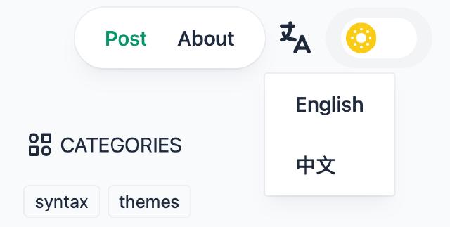
For the complete code, please refer to #0244464 .
Additional Benefits
My native language is Chinese, and I can read English quite well, so I initially only implemented Chinese and English. But how can I add more languages to the theme? 2023 was a year of significant growth for large language models, and with the help of LLMs, I translated the language files into more languages like Russian and Japanese using prompts.
Here, I used the gemini interface to process the i18n files:
import google.generativeai as genai

# get key from https://makersuite.google.com/app/apikey
GOOGLE_API_KEY = 'YOUR_GOOGLE_API_KEY'
genai.configure(api_key=GOOGLE_API_KEY)
model = genai.GenerativeModel('gemini-pro')

prompt_template = '''You are a translator and your task is to translate l10n file to different languages.
The l10n file is provided in TOML format. The file contains {{ KEY }} for variables and use
`one` for singular and `other` for plural.

The TOML file is quoted in triple backtick. Please translate the content to {lang}
and keep the original content structure, also remove triple backtick in output:

```toml
{en_file_content}
```
'''

en_file_content = ''
with open('./en.toml', 'r') as f:
    en_file_content = f.read()

prompt = prompt_template.format(lang='Chinese', en_file_content=en_file_content)

response = model.generate_content(prompt)
print(response.text)
In the prompt, I included some hugo and code-related instructions, like the file format is TOML, using {{ KEY }} for variables,
and handling singular and plural with onefor singular andother for plural.
I also used instructions to ensure the LLM output retained the original format. I tested with Chinese, which I’m familiar with, and the above code output the following:
table_of_contents = "目录"
open_main_menu = "打开主菜单"
open_lang_switcher = "打开语言切换器"
[reading_time]
  one = "阅读时长一分钟"
  other = "阅读时长{{ .Count }}分钟"

[header]
darkmode_toggle = "切换深色模式"

[404]
go_back_home = "返回主页"
sorry = "抱歉,找不到您要查找的页面。"
page_not_found = "页面未找到"

[footer]
powered_by = "由{{ .Generator }} {{ .Heart }} {{ .Theme }}提供支持"
copyright_with_since ="{{ .CopyrightSign }} {{ .SinceYear }} - {{ .CurrentYear}} {{ .Copyright }}"
copyright_wo_since ="{{ .CopyrightSign }} {{ .CurrentYear}} {{ .Copyright }}"

[paginator]
newer_posts = "较新的文章"
older_posts = "较早的文章"

[taxonomies]
categories = "分类"
tags = "标签"
series = "系列"
The final result was quite good. The file structure was correct, and the variables were preserved. I used a similar method to generate localization files for other languages. Of course, I don’t actually speak Russian, Japanese, etc., so I couldn’t accurately judge the quality of the translations.
Others
Shortcodes
Hugo provides shortcodes to extend markdown rendering capabilities. shortcodes are reusable code snippets that can make editing markdown more efficient. Hugo has some built-in common shortcodes, like figure, gist, etc. You can refer to https://gohugo.io/content-management/shortcodes/
.
Some of my blogs use asciinema to record terminal interactions, and I use shortcodes to conveniently embed asciinema.
Hugo searches for shortcodes code in a specific order, with the file name being the final name used in markdown:
/layouts/shortcodes/<SHORTCODE>.html/themes/<THEME>/layouts/shortcodes/<SHORTCODE>.html
I created the layouts/shortcodes/asciinema.html file and referenced the official embedding documentation:https://docs.asciinema.org/manual/server/embedding/#inline-player
. I wrote the following content in the html:
{{ $id := .Get 0 }}

<script async id="asciicast-{{ $id }}" src="https://asciinema.org/a/{{ $id }}.js"></script>
where .Get 0 means getting the first parameter. Of course, you can also use named parameters. The usage is:
{{< asciinema 239367 >}}
The effect is as follows:
Render Hooks
Hugo uses goldmark
to render markdown, and render hooks allow developers to override the rendering of specific components. Currently supported are:
- image
- link
- heading
- codeblock
Simply, we can add additional attributes to the a tag rendered by the link to ensure security. For example, add the filelayouts/_default/_markup/render-link.html with the content:
<a href="{{ .Destination | safeURL }}"{{ with .Title }} title="{{ . }}"{{ end }}{{ if strings.HasPrefix .Destination "http" }} target="_blank" rel="noopener"{{ end }}>{{ .Text | safeHTML }}</a>
This code adds the rel="noopener" attribute when rendering links to external sites.
Of course, more complex operations can be added to the rendering of images, such as lazy loading, scaling images to fit different resolutions,
and converting images to compressed formats. You can refer to the processing in layouts/_default/_markup/render-image.html
.
Code Block Syntax Highlighting and Copying
Hugo uses chroma
for code highlighting. It works well with the default configuration, but I want to go further,
such as having the code block theme switch along with the light and dark modes, and providing code block copying functionality.
To support custom styles, we need to adjust the code highlighting configuration in the config/_default/hugo.toml file to use CSS classes to apply highlighting styles:
[markup.highlight]
  noClasses = false
Then use the command to generate code highlighting styles for our light and dark themes:
hugo gen chromastyles --style=solarized-light
hugo gen chromastyles --style=solarized-dark
Write the styles into the main style file. For the dark theme, you can use the column editing mode of the IDE to add .dark before each line of style to restrict it.
The effects under light and dark themes are as follows:
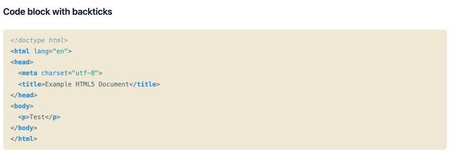
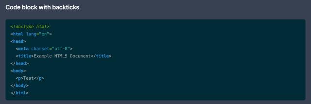
However, in some cases, chroma’s default CSS styles may conflict with tailwindcss’s typography plugin. For example, when the line number configuration is enabled, you will find that there is a large gap between the code line numbers and the code block:

This is because chroma uses table elements when rendering line numbers, while typography adds additional margins to pre elements.
In this case, we need to find the conflict points and then override some styles. The following CSS styles will remove the margins and border-radius of the pre elements in code blocks with line numbers and change the display property of the table:
/* fix highlight with line number */
.highlight .chroma .lntable {
  margin: 1.7142857em 0;
  padding: 0.8571429em 1.1428571em;
  border-radius: 0.375rem;
  overflow: hidden;
}

.highlight .chroma .lntable pre {
  margin: 0;
  padding: 0.8571429em 0;
  border-radius: 0;
}

/* https://caniuse.com/css-has */
.highlight .chroma:has(table) {
  background-color: transparent;
}

.highlight .lntable tr {
  display: flex;
}

.highlight .lntable tr .lntd:last-child {
  flex-grow: 1;
}
Code block copying is achieved by checking if there are pre elements on the page, then finding the .highlight elements on the page, and adding corresponding copy buttons.
I used the statement {{- if (findRE "<pre" .Content 1) }} in baseof.html to search for elements,
which reduces JavaScript loading. Additionally, note that code blocks with line numbers will render two code elements, and we need to take the last one.
Relevant code can be found at #4d62bba
and #df6ac6d
.
Pipes
When allowing users to modify the theme, we need to keep the original CSS and JavaScript code.
But for general direct users, we need to shield these code compilation logic while ensuring that the final generated static resources are compressed.
Here we can use the pipes feature provided by Hugo.
For tailwindcss, I initially placed the original CSS style in assets/css/main.css, the compiled code in the static folder static/main.css, and directly referenced the static file in head.html:
<!-- Theme CSS (/static/main.css) -->
<link rel="stylesheet" href="{{ "main.css" | relURL }}" />
I wanted to display the original CSS style during development but use the compressed version with a hashed filename when deployed.
Ultimately, I adjusted the location of the CSS files, placing both the pre-compiled and post-compiled CSS code in assets/css
(so that Hugo can process the resources), and adjusted the inclusion of CSS files:
{{- $styles := resources.Get "css/index.css" -}}
{{- $env := getenv "HUGO_THEME_DEVELOPMENT" -}}

{{- if eq $env "true" }}
  {{- $styles = resources.Get "css/main.css" | postCSS (dict "config" "./postcss.config.js") -}}
{{ end -}}

{{- if hugo.IsDevelopment }}
  {{- $styles = $styles | resources.ExecuteAsTemplate (printf "css/main.dev.%v.css" now.UnixMilli) . -}}
{{ else }}
  {{- $styles = $styles | minify | fingerprint -}}
{{ end -}}
<link rel="stylesheet" href="{{ $styles.RelPermalink }}">
Here, I use HUGO_THEME_DEVELOPMENT to identify the theme development mode, and process CSS styles using PostCSS in theme development mode.
When using the hugo server command, Hugo is in development mode, hugo.IsDevelopment is true,
and filenames with timestamps are used in development mode to prevent caching. In production mode, | minify | fingerprint is applied for compression and file caching.
Regarding the environments corresponding to different Hugo commands, you can refer to the following table:
| Command | Environment |
|---|---|
hugo | production |
hugo --environment staging | staging |
hugo server | development |
hugo server --environment staging | staging |
Similarly, we can handle JavaScript files in a similar way, such as for code block copying:
{{- $jsCopy := resources.Get "js/code-copy.js" | js.Build "code-copy.js" -}}
{{- if not hugo.IsDevelopment }}
  {{- $jsCopy = $jsCopy | minify | fingerprint -}}
{{ end -}}
<script src="{{ $jsCopy.RelPermalink }}"></script>
Lighthouse
I’ve completed most of the code writing, but I still need to check if the pages rendered by my theme conform to some standards and best practices.
I used the built-in lighthouse developer tool in chrome to check the site.
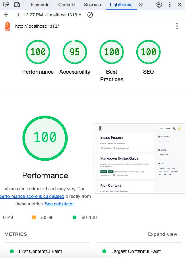
It can be seen that the performance score of the site is good, but there is room for improvement in accessibility and SEO. For example, the contrast of some colors in the theme, the alt attribute of images, etc.
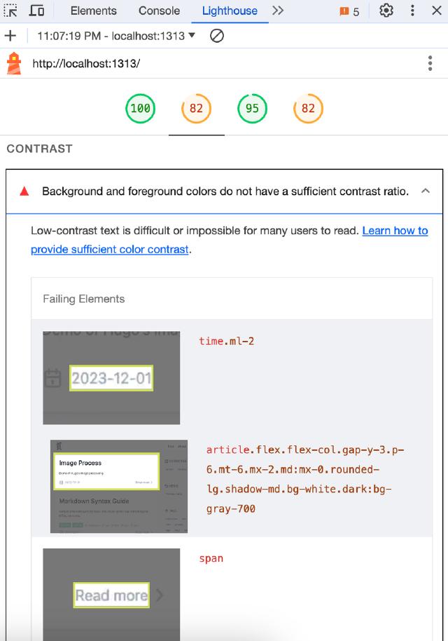
Based on lighthouse’s suggestions, I made adjustments and optimizations for each suggestion, and finally, the lighthouse score reached a high level:
