This is a series of blog posts documenting my process of building a Hugo theme from scratch (https://github.com/tomowang/hugo-theme-tailwind ). The series consists of four articles, and this is the second one:
- I. Introduction to the background of building the Hugo theme, my ideas for the theme’s features, and the development environment setup
- II. The main directory structure of the Hugo theme, the technologies involved, and the main framework of the theme I created
- III. Additional features of the Hugo theme, including dark mode, responsive design, multilingual support, code highlighting, and build pipeline
- IV. This part describes non-code-related content, including continuous integration (CI), how to submit to the official theme site, and SEO-related data
Hugo Theme Basics
Before we start building the theme, we need to have a basic understanding of some terms, syntax, and directory structure of Hugo themes.
Basic Syntax
Hugo uses html/template to render content, and methods and variables are accessed through {{ }}. Commonly used syntax is as follows:
- Variable rendering -
{{ $address }} - Method call -
{{ FUNCTION ARG1 ARG2 .. }} - Loop
{{ range $array }} {{ . }} <!-- The . represents an element in $array --> {{ end }} - Conditional statements -
withifelseetc.{{ with .Params.title }} <h4>{{ . }}</h4> {{ end }} {{ if (isset .Params "description") }} {{ index .Params "description" }} {{ else }} {{ .Summary }} {{ end }} - Pipeline -
{{ .Title | .RenderString }} - Context
.and global context$. - Use hyphen
-to remove extra empty strings<div> {{- .Title -}} </div>
For a detailed description of the syntax, you can refer to the official documentation https://gohugo.io/templates/introduction/ .
Hugo also provides many built-in variables, which are rendered through the theme file to ultimately generate static pages:
- Site - Site object
- Pages - Aggregation of pages
- Page - Single page object
- Menu - Menu list
- Menu entry - Single menu object
- Taxonomy - Single taxonomy object
When using a theme to render page content, we need to call attributes or methods based on the corresponding variables to finally present the content we want.
For example, if we want to display the reading time of a single article, we can call the ReadingTime method (https://gohugo.io/methods/page/readingtime/
) of the Page variable.
Some objects have many methods, you can refer to the official documentation for details https://gohugo.io/quick-reference/methods/
.
Directory Structure
After we create a basic Hugo theme, we can use the command tree -L 2 -d . to view the basic structure of the theme directory:
.
├── archetypes
├── assets
│   ├── css
│   └── js
├── data
├── i18n
├── layouts
│   ├── _default
│   └── partials
└── static
The meanings of the relevant directories are as follows:
archetypes- Templates for creating new content pagesassets- Static resource files, usually processed through the resource pipelinedata- Used to store additional data, you can refer to https://gohugo.io/templates/data-templates/i18n- Stores localization fileslayouts- Core template layout filesstatic- Static files that will be copied directly to the final public directory
The most important one is the layouts directory, which determines the pages supported by the template and the layout of the pages. Hugo uses a set of rules to query which template file should be used for the content page. A typical site consists of the following types of pages:
- Home page
- Single page
- List page
- Term page
- Term list page
The lookup order can be referred to in the official documentation https://gohugo.io/templates/lookup-order/ . The official documentation describes the complex lookup order, but most page structures of the theme are similar, so in actual situations, only a few pages need to be defined to achieve the desired result.
Theme Content Construction
tailwindcss
Before starting to build, we need to install tailwindcss. I made some adjustments based on the official documentation:
# install
pnpm install -D tailwindcss
# init
npx tailwindcss init
Install tailwindcss and generate tailwind.config.js configuration file through the above commands.
Since our page content is in the layout directory, we need to adjust the content configuration in tailwind.config.js:
content: ["./layouts/**/*.html"],
Place the tailwindcss reference in assets/css/main.css:
@tailwind base;
@tailwind components;
@tailwind utilities;
Then we can monitor the page content and generate the actual CSS file to be used through the following command:
npx tailwindcss -i assets/css/main.css -o ./static/main.css --watch
Basic Layout
Based on my needs and the description of the Hugo directory structure in the previous section, I finally defined the following basic pages:
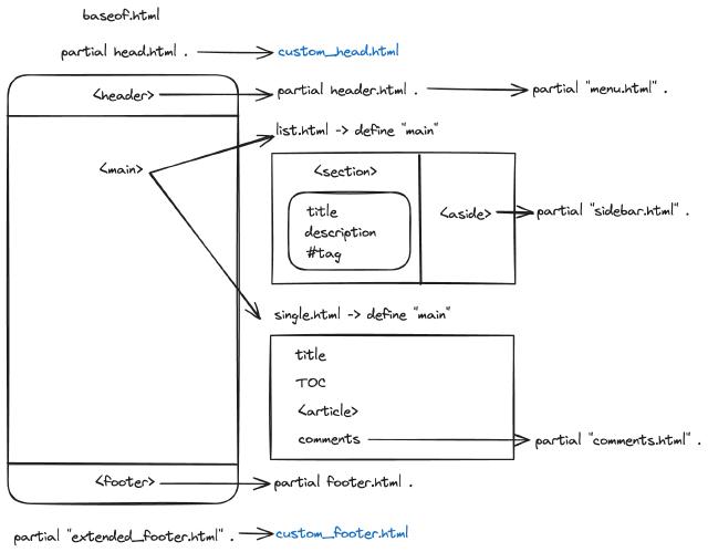
baseof.html- Carries the layout of the main pagelist.html- List page, term list pagesingle.html- Single page, the main content pageterms.html- Term page
Through the baseof.html file, we define the basic template, which will be applied to all pages. Its core content is as follows:
<!DOCTYPE html>
<html lang="{{ or site.Language.LanguageCode site.Language.Lang }}" dir="{{ or site.Language.LanguageDirection `ltr` }}">
<head>
  {{ block "title" . }}
    <title>
      {{ if .IsHome }}{{ $.Site.Title }}{{ with $.Site.Params.Subtitle }} —
      {{ . }}{{ end }}{{ else }}{{ .Title }} ::
      {{ $.Site.Title }}{{ with $.Site.Params.Subtitle }} — {{ . }}{{ end }}{{ end }}
    </title>
  {{ end }}
  {{ partial "head.html" . }}
</head>
<body class="w-full bg-slate-50">
  <header class="flex flex-none justify-center">
    {{ partial "header.html" . }}
  </header>
  <main class="flex flex-auto justify-center">
    {{ block "main" . }}{{ end }}
  </main>
  <footer class="flex flex-none justify-center">
    {{ partial "footer.html" . }}
  </footer>
</body>
</html>
I use {{ partial "head.html" . }} to include the content required by the head tag, and refer to the CSS file generated earlier in head.html:
<!-- Theme CSS (/static/main.css) -->
<link rel="stylesheet" href="{{ "main.css" | relURL }}" />
In the HTML body tag, the header tag is the top navigation, the footer tag is the bottom menu, and the main tag is the main content.
The content of {{ block "main" . }}{{ end }} in the main tag needs to be defined on other pages. For example, the simplified list.html code is as follows:
{{ define "main" }}
  <div class="flex flex-col w-full max-w-4xl lg:max-w-5xl relative">
    <div class="flex flex-row">
      <section class="flex flex-col w-2/3">
        {{ range (.Paginate $pages).Pages }}
          <article class="flex flex-col gap-y-3 p-6 mt-6 rounded-lg shadow-md bg-white">

            <h2 class="text-4xl font-semibold text-slate-800">
              <a href="{{ .RelPermalink }}">{{ .Title | markdownify }}</a>
            </h2>
          </article>
        {{ end }}
      </section>
      <aside class="flex flex-col w-1/3 mx-3 top-0 sticky self-start">
        {{ partial "sidebar.html" . }}
      </aside>
    </div>
    {{ partial "pagination.html" . }}
  </div>
{{ end }}
Among them, the section tag corresponds to the article list block, and the aside tag corresponds to the side term display block.
The content of the single page single.html is similar, including the article title, TOC content, article body, etc.
The advantage of tailwindcss is that there is a ready-made typography plugin that can directly render the content of the article without having to define complex CSS styles additionally.
The overall reference relationship can refer to the following figure:

In order to reuse some components, such as tag lists, reading time, icons, etc., we can abstract the same content and put it in the layouts/partials directory.
Taking icons as an example, I use https://tabler.io/icons
as the source of icons,
Download the corresponding icon SVG file to the assets directory and define a partial page:
{{- $iconFile := resources.GetMatch (printf "icons/%s.svg" .) -}}
{{- if $iconFile -}}
    {{- $iconFile.Content | safeHTML -}}
{{- else -}}
    {{- errorf "Error: icon '%s.svg' is not found under 'assets/icons' folder" . -}}
{{- end -}}
Among them, the symbol . is the passed icon name parameter, so that we can quickly refer to the icon in the page, such as
{{ partial "icon" "calendar" }}
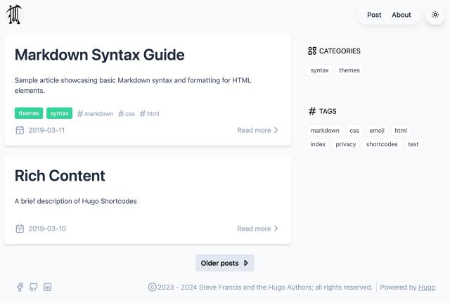
Through about 5 days of spare time development (#bf54ab9 ), the final effect is as follows:

Of course, this is the first phase of the content, only with a white theme (the theme switch button does not respond when clicked), no multilingual support, and no responsiveness.
But the main page structure is already there, and tailwindcss has shown its efficient and flexible characteristics in dealing with CSS styles.
